Instructions: Redesign an existing Home Page for a Career Development/Contacts Mobile App
Roles: UI/UX Designer, UI Auditor
Programs: Figma
For this project, an application in its beta stage had to be redesigned. I then had to identify what type of users would be using this app and what pain points were noticeable throughout the user's journey.
This application aims to ease the networking process and act as a home base for your professional needs. This app would allow the user to import or create contacts, and the user can rank their contacts based on priority levels. This app also has integrated interaction tracking, where users can log all instances of communications with their contacts. You can rate these interactions and leave notes about how they went. An algorithm will then give each contact a "strength" value, highlighting which contacts you have stronger and weaker connections with. This insight will help guide the user where their networking efforts need to be allocated.
I had a several cores ideas that influenced my design process, aiming to transform this application into a digestible process, that also encouraged the user to implement this app into their routines by adding new features that the demographic would want.
User Interface Audit
Target Demographic
- Fresh college graduates
- Adults looking to switch companies.
User Experience Issues
- Visual overload: Too much data on screen
- Navigation: Rigid movement between pages
- Complexity: Confusing layout, lacking
- Feature gap: Missing useful networking tools
Key Findings
- App purpose: Accessible career directory
- User sentiment: Frustration and confusion
- Retention concern: Not much to return to
Improvement Areas
- Enhance navigation fluidity
- Add features catering to networking needs
- Create a more user-friendly experience
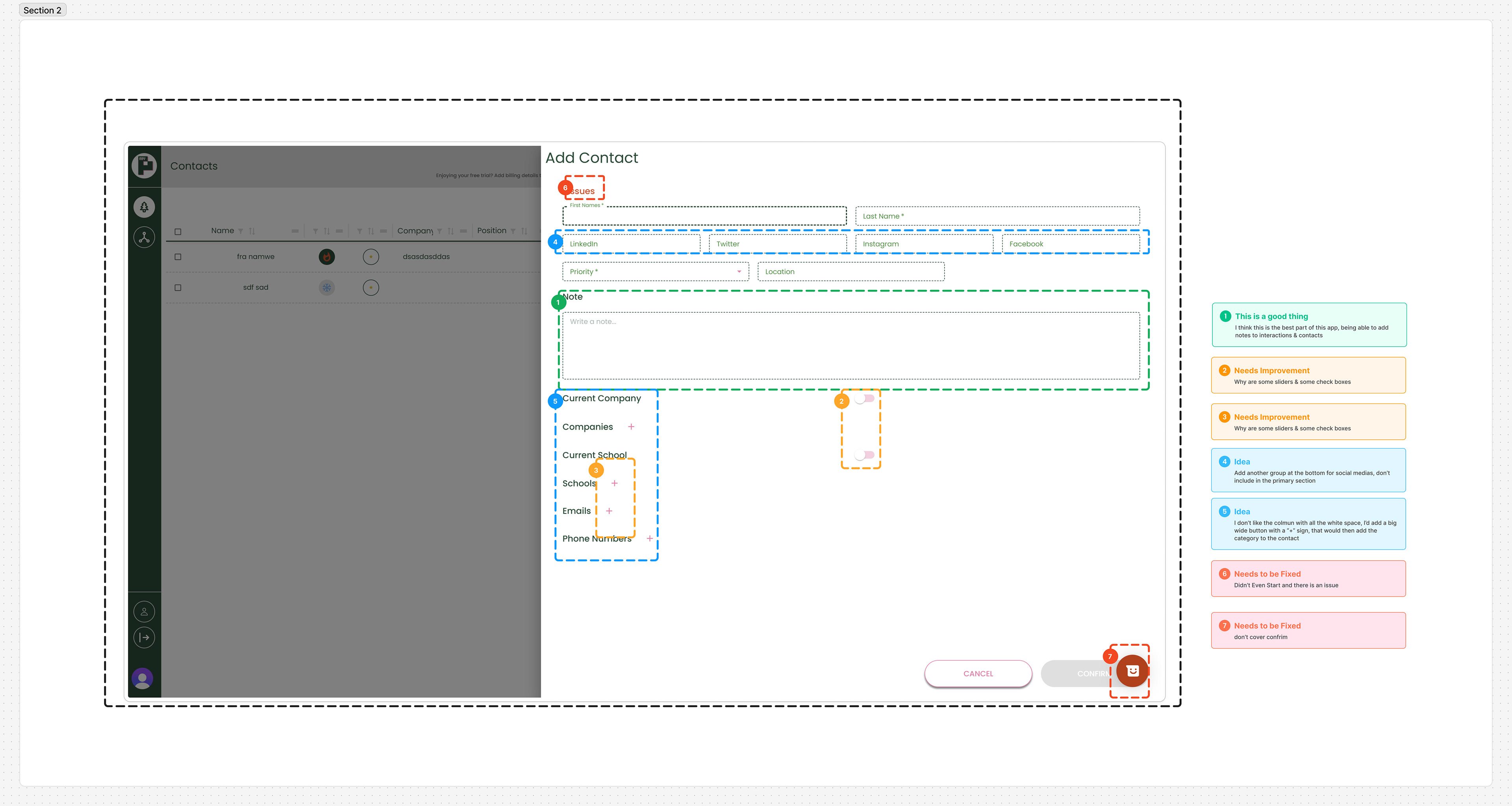
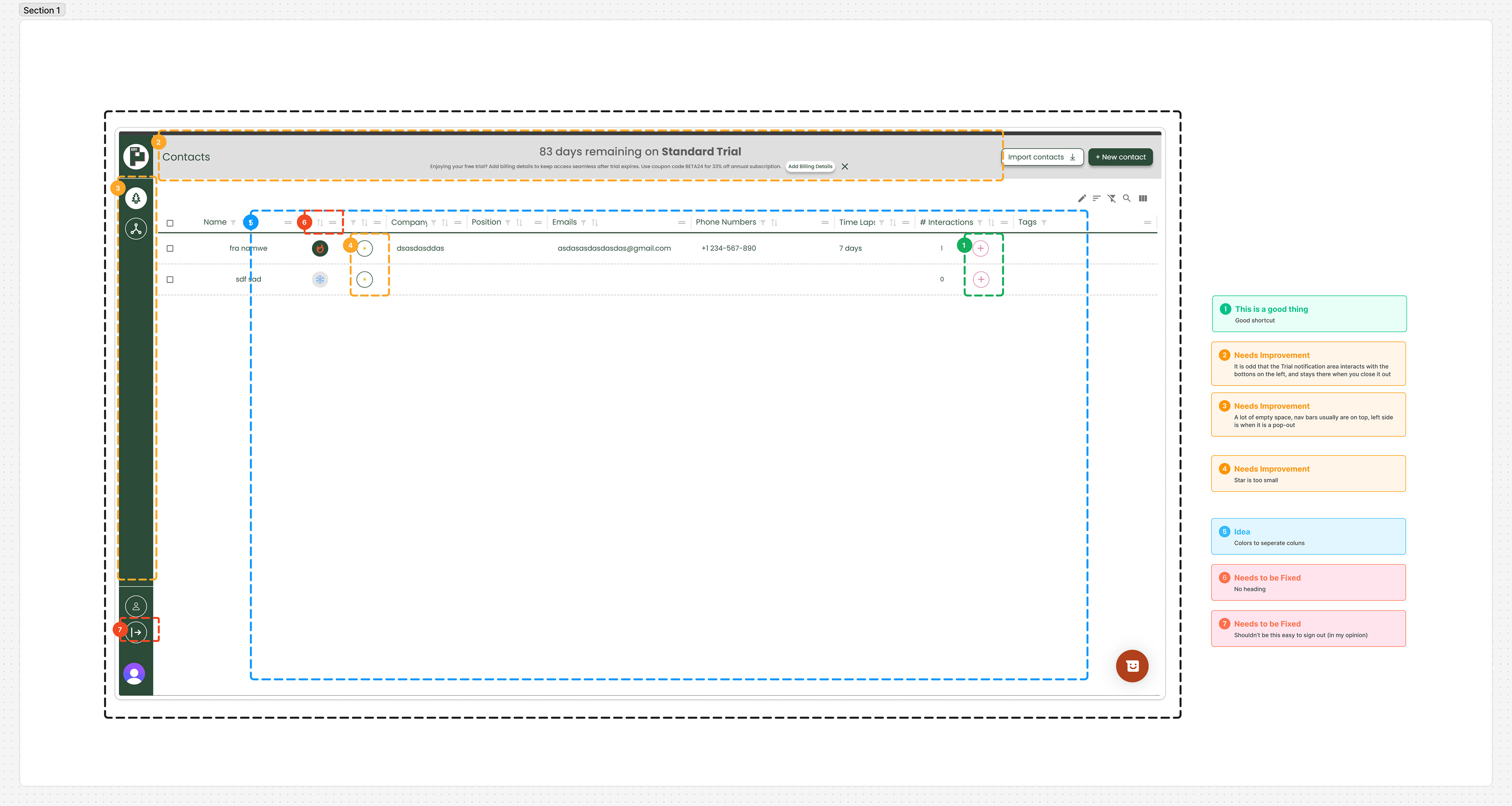
The audit revealed significant usability issues that hinder the app's effectiveness as a networking tool for college students. Here are some of screenshots of the notes from my audit:
Icon & Visual Changes
New Icon Set
- Created a cohesive and clear icon system
- New color palette for consistency
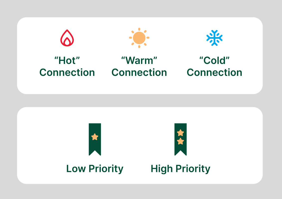
Connection Status Icons
- Top three icons represent connection status
- Flame: "Hot Connection" (strong relationship)
- Sun: "Warm Connection"
- Snowflake: "Cold Connection"
Priority Tags
- User-defined importance levels
- Redesigned for better visibility
- Distinct yet harmonious with overall design
Icon Interplay
- Combined connection status and priority for user insights
- Example: High priority + cold connection = needs more interaction
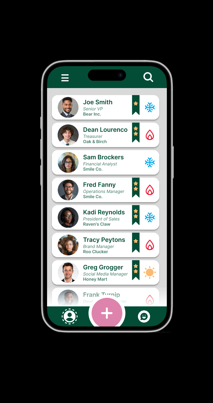
Contact Card Redesign
- Streamlined to show essential information
- Optimized for growing contact lists
- Facilitates easy navigation
Photo Integration
- Added space for contact photos
- Acknowledges importance of visual recognition in modern networking
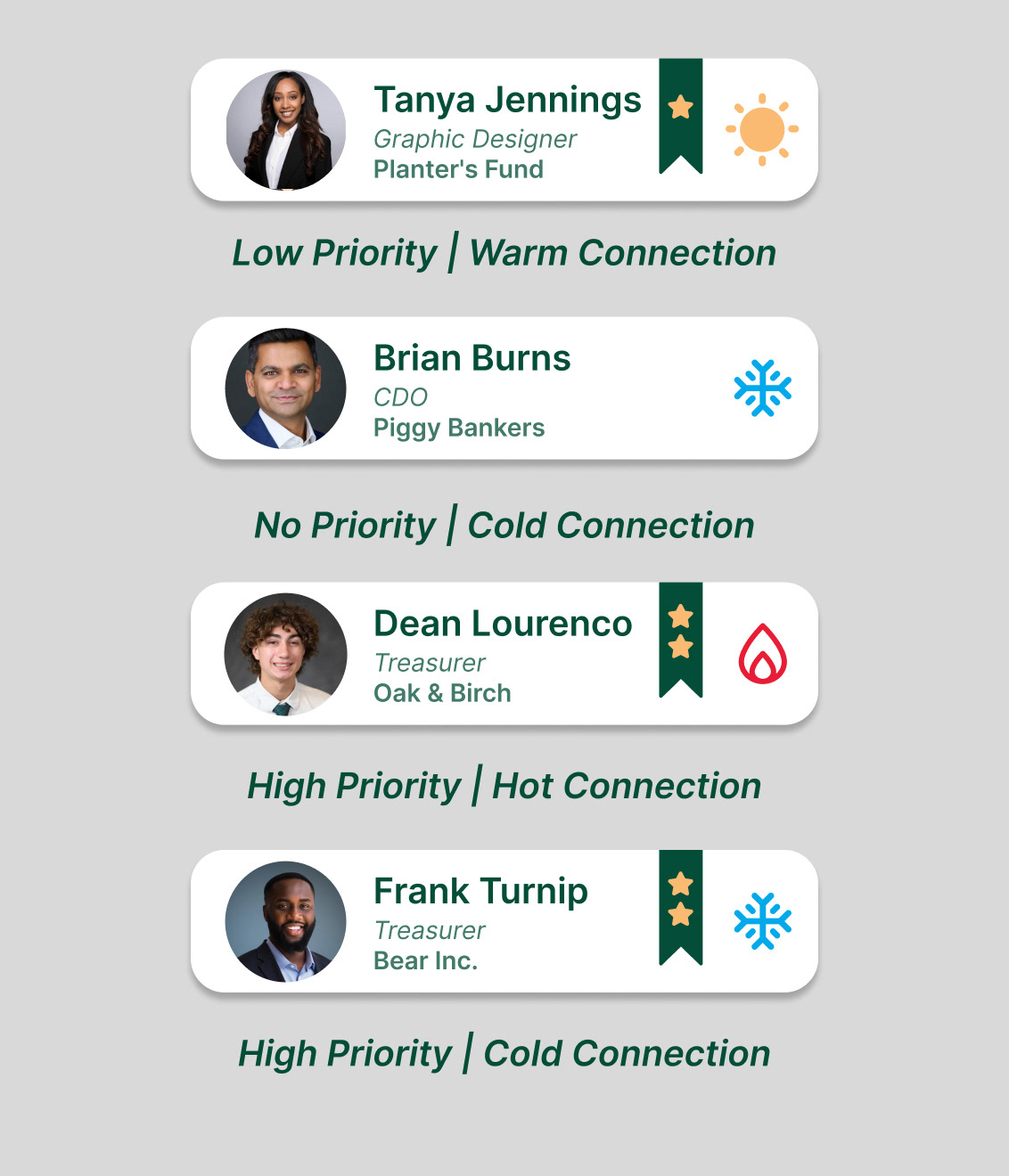
Overall, these changes aim to enhance user understanding, improve navigation, and provide valuable networking insights at a glance.
Homebase
A concise home page, with the ability to quickly swap between your interactions and your contacts. The user can also access, like a dropdown menu, search bar, and the large "add" button for adding a new contact and/or interaction.
Contacts Page
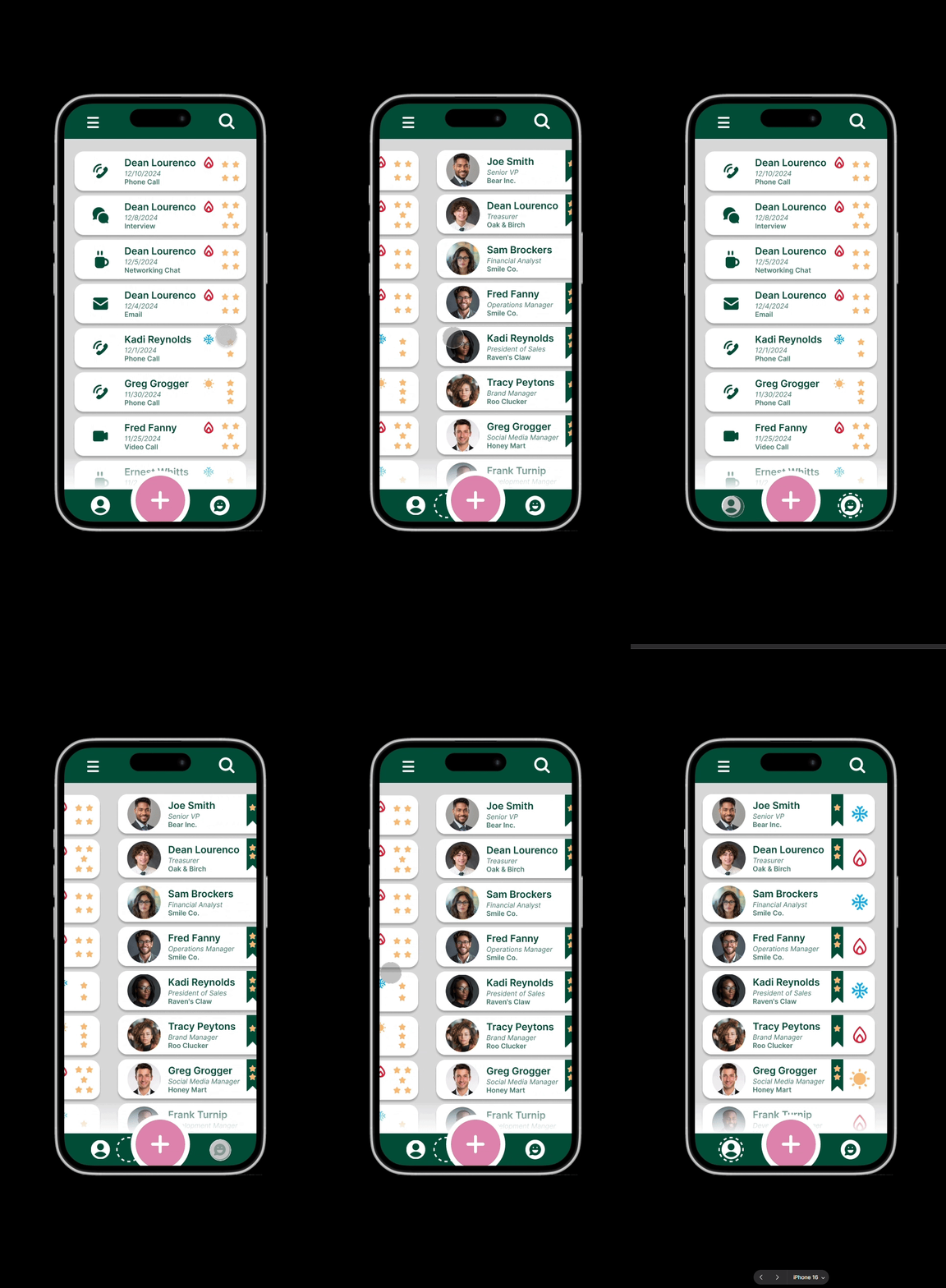
Switching Between

Interactions Page
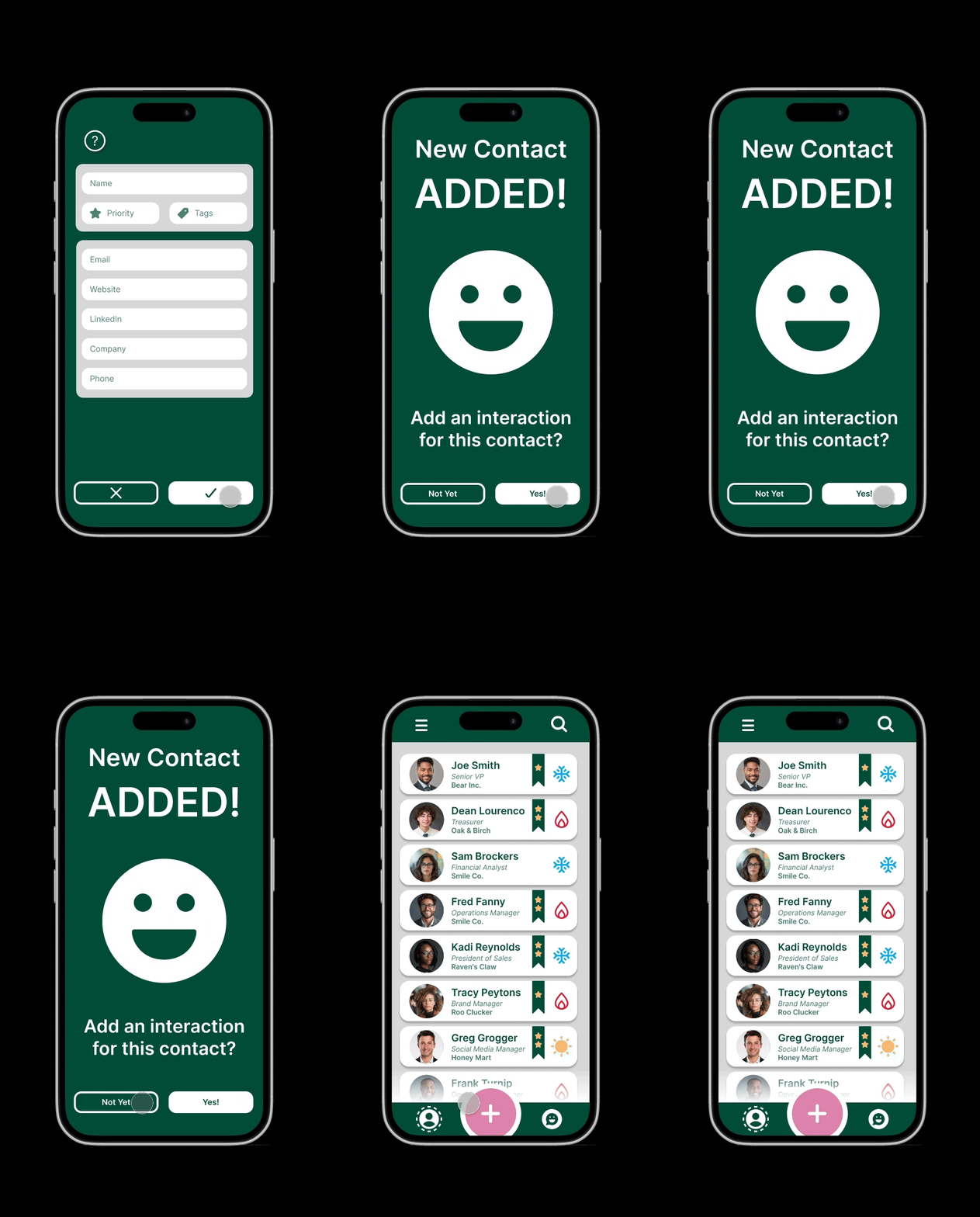
Creation Process
Initiation
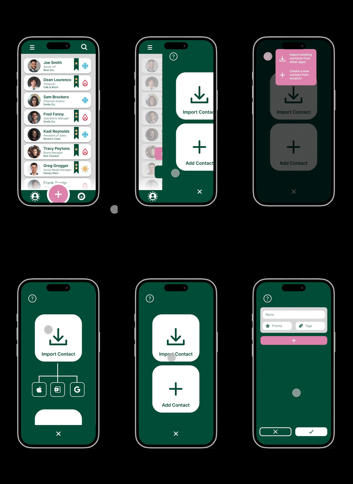
- Large pink button in bottom banner for adding new information
- Always accessible, emphasizing core app functionality
Streamlined User Flow
- Segmented process into logical steps
- Replaced overwhelming single-page input with step-by-step approach
Contact Addition Options
- Import from third-party sources (Google, iCloud, vCard)
- Manual entry option
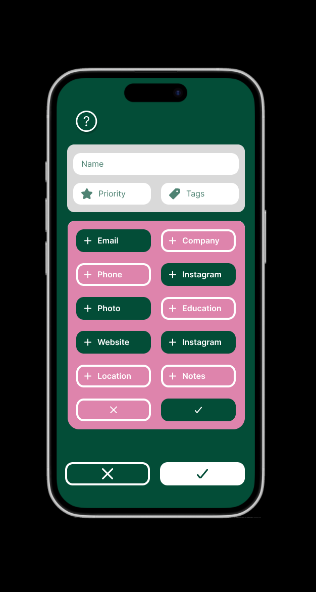
Manual Contact Creation
- Focus on essential information (name, priority, custom tags)
- Dropdown menu for additional details, reducing clutter
- Customizable to user needs
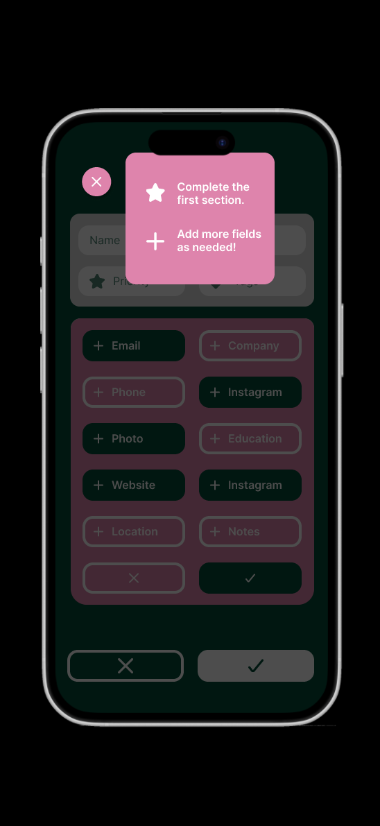
User Assistance
- "?" button for help throughout the process
- Slide-in pop-up with guidance for new users
Completion and Follow-up
- Congratulatory message upon adding a new contact
- Option to immediately add an interaction or return to home page
Interaction Addition
- Similar streamlined process
- Auto-fill feature for newly added contacts
UI/UX Enhancements
- Gentle animations for user engagement
- Seamless flow without feeling like separate pages
1
2
3
4
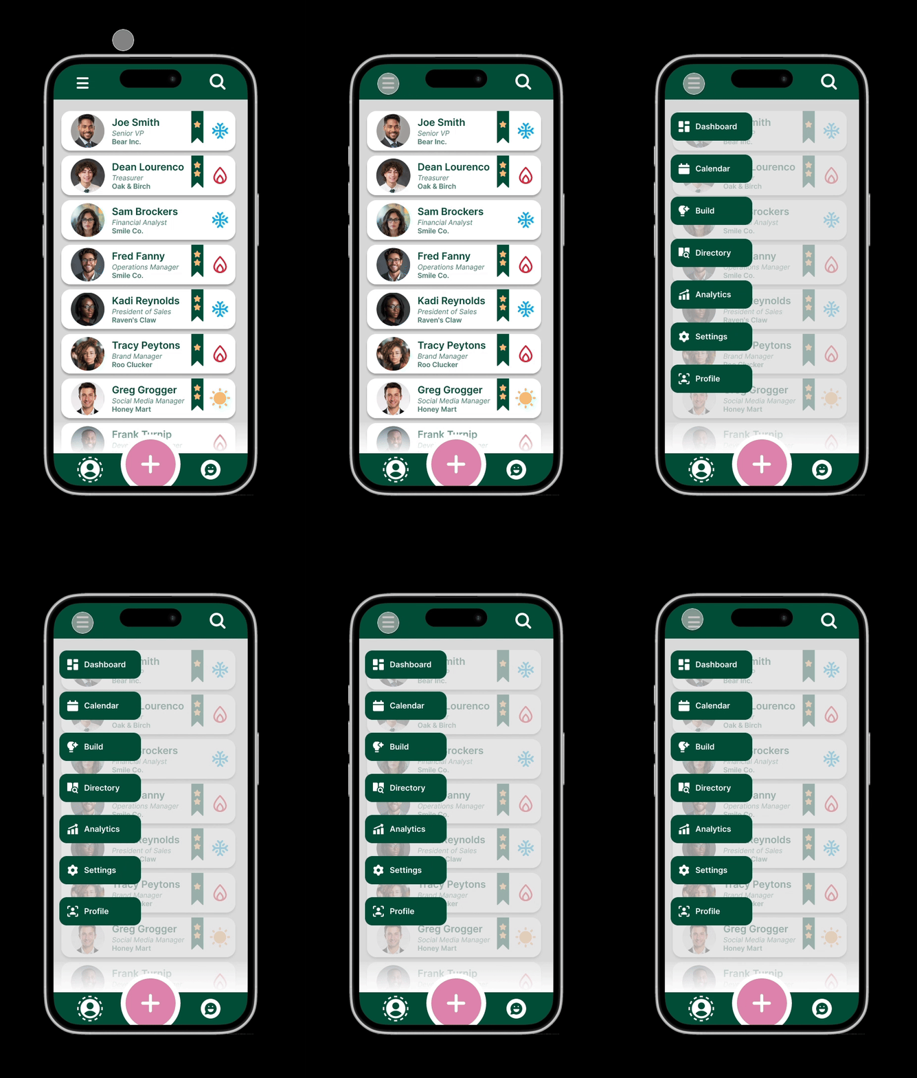
Top Navigation Banner
The header features two key elements: a dropdown menu for navigating between application pages and a universal search bar. This search bar serves as a versatile filter, allowing users to find specific contacts by criteria such as connection status, company, priority, and more, thereby helping them organize their contacts according to their needs.
Dropdown Menu
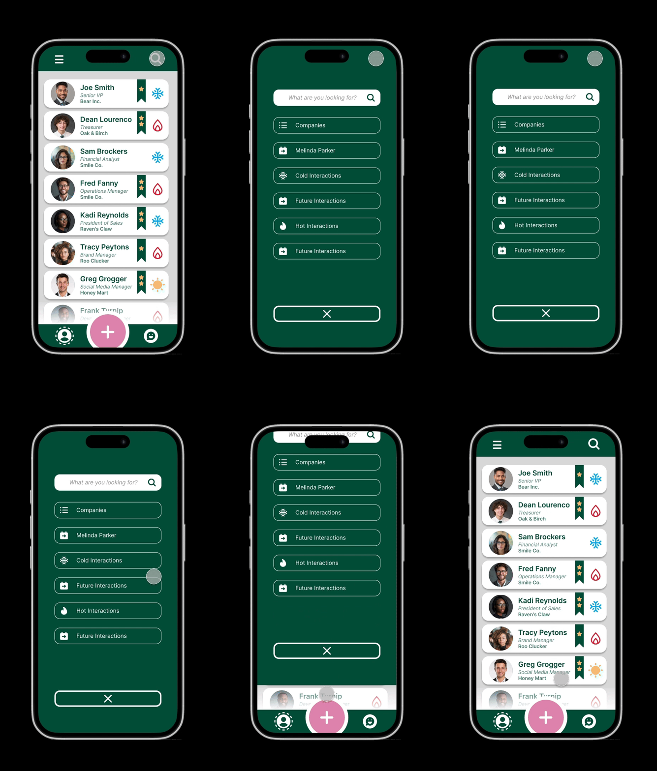
Search Page
New Features
To better support users' professional development, the application now includes three powerful new tools:
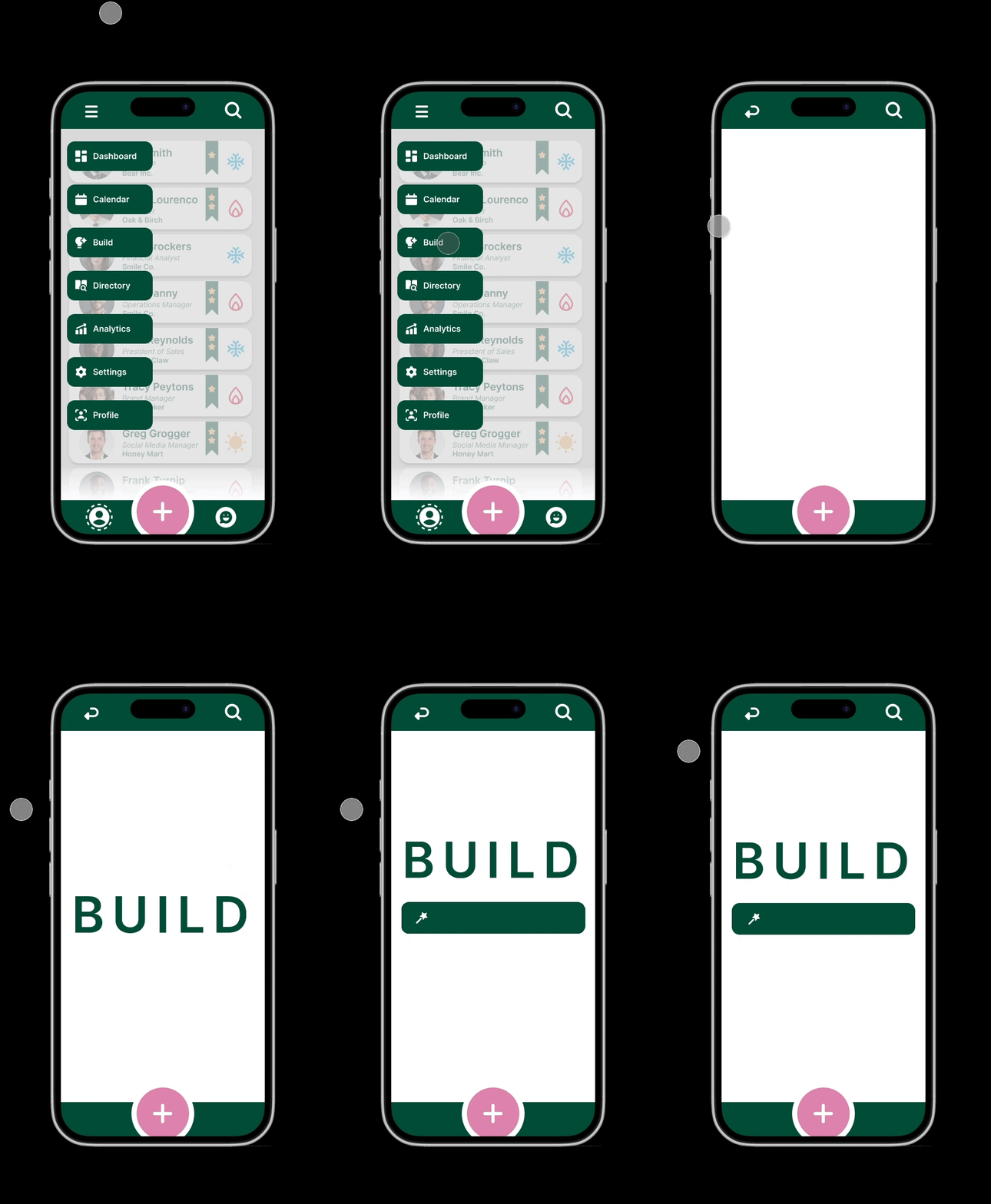
1: AI-Powered Build Page
- In-house artificial intelligence assistant
- Helps create email prompts
- Facilitates mock interview practice
- Generates customized to-do lists
2: Interactive Interactions Calendar
- Centralizes all past and future networking interactions
- Provides a visual timeline of professional engagements
3: Comprehensive Dashboard
- Quick-access sharing for resumes and portfolios
- Customizable to-do lists
- Progress tracking tools for career goals
These additions transform the app into a more robust career management platform, offering users practical tools to enhance their networking efforts and professional growth.
1 - AI Build Tool
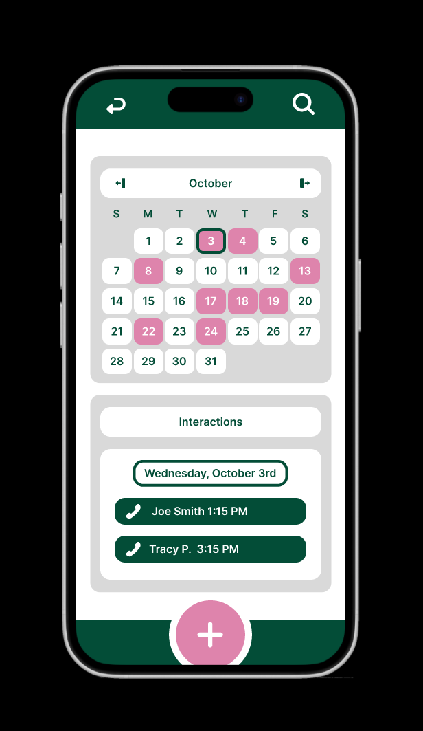
2 - Interactions Calendar
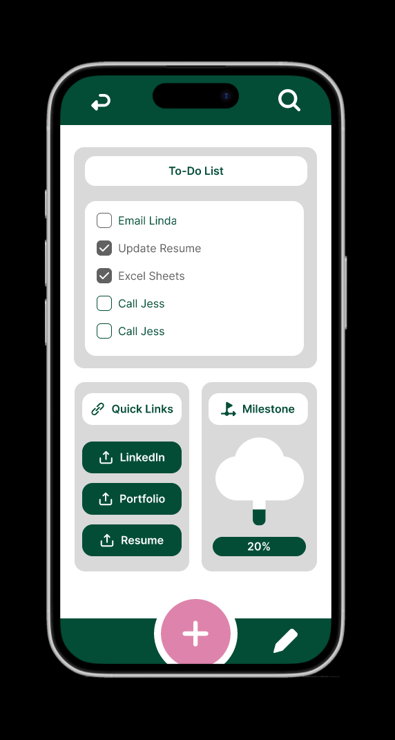
3 - Dashboard
The Final Product: Enhanced Networking Tool
This redesign aimed to preserve the original vision by simplifying the interface and enhancing user experience. By integrating new features and streamlining the user flow, the application now serves as a valuable networking tool for users of all ages. Its unique approach combines contact management with personalized interactions, offering a distinctive edge in professional networking.

